WHAT IS PANTONE?
Pantone is a company that specializes in everything color, from psychology to branding and even trend reports. In 1963, they developed the PANTONE MATCHING SYSTEM, which allowed anyone in any industry to accurately reproduce any color anywhere, whether it be in print or fashion. For over 20 years now, they have declared a color of the year, but only recently have they pushed it to be part of their marketing plans.
HOW IS THE COLOR PICKED?
According to their website, Pantone hosts a meeting in a European Capital with the world’s various color standard groups. After two days of presentation and debate, they pick their color. The selection process is no joke, the panel of representatives from these color standard groups take into mind all areas of media, lifestyles, socio-economic conditions, new technologies, big world events, or even just a new textile.
WHY IS THE COLOR OF THE YEAR IMPORTANT?
Many designers of all backgrounds use the color as a starting point to explore. You might notice in the months following the color’s reveal that more items of that color are surfacing.
Last year, the colors were Ultimate Gray and Illuminating (a shade of yellow). Did you notice a lot of yellow and gray in clothing or furniture trends? The Pantone color of the year is why!
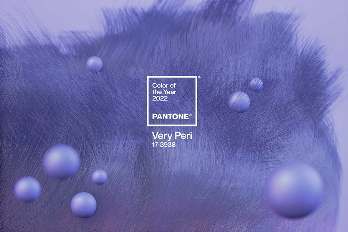
"As we move into a world of unprecedented change, the selection of PANTONE 17-3938 Very Peri brings a novel perspective and vision of the trusted and be-loved blue color family, en-compassing the qualities of the blues, yet at the same time possessing a violet-red undertone, PANTONE 17-3938 Very Peri displays a spritely, joyous attitude and dynamic presence that encourages courageous creativity and imaginative expression."
- Leatrice Eiseman, Executive Director, Pantone Color Institute


